
So, fun fact, the Canadian flag, long may it fly, is really easy to get wrong. Why? Mainly due to the aspect ratio.
First, let’s review the spec for the Canadian Flag. The Government of Canada has a page with general specifications for the flag, but it’s not really detailed enough for you to make a properly conforming flag or graphic. It does however refer you to the relevant Canadian General Standards Board specs that do go into gory detail, but without a direct link.
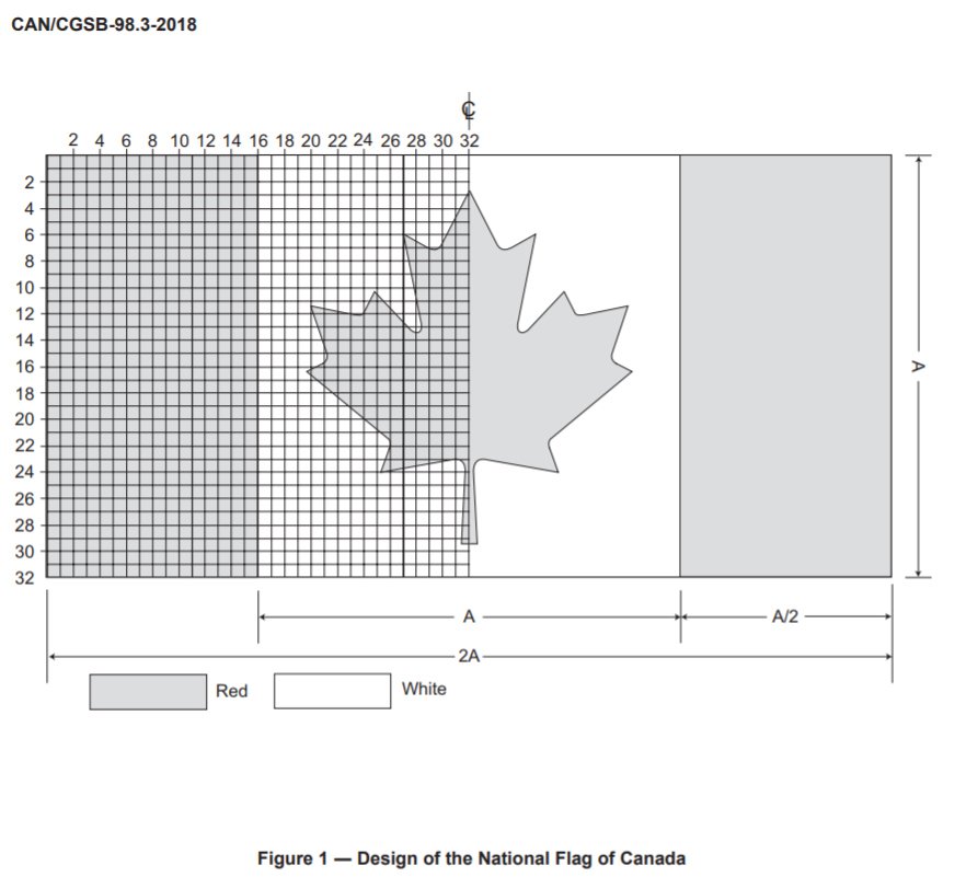
For your edification, I present CAN/CGSB-98.1-2011, National Flag of Canada (Outdoor Use)! It includes detailed graphics and information about the specified colours. It also has details about what kind of grommets you should use, which are omitted from the Indoor Use and One-event Only Use documents. All three, I believe, contain the same basic flag spec info, though.
Now let’s look at some bad flags, very un-Canadian.
Nope 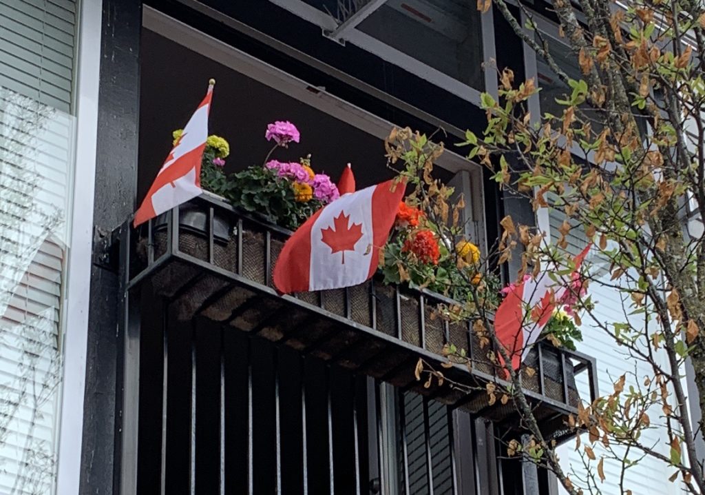
Nope 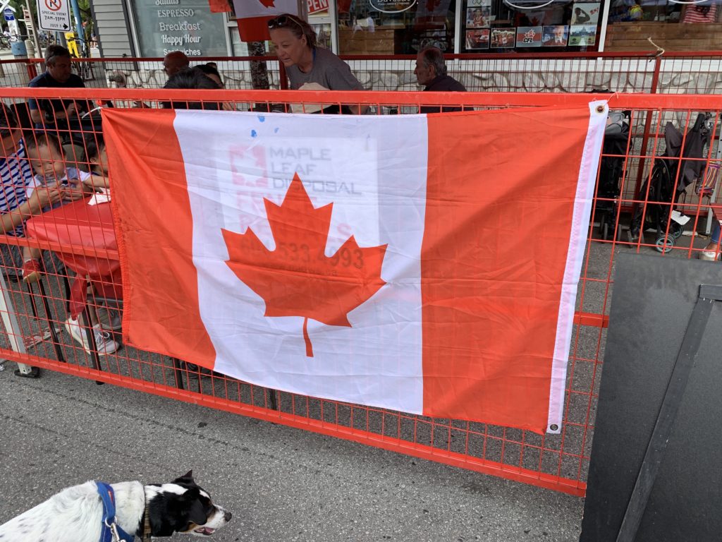
Nope 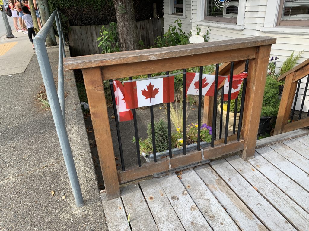
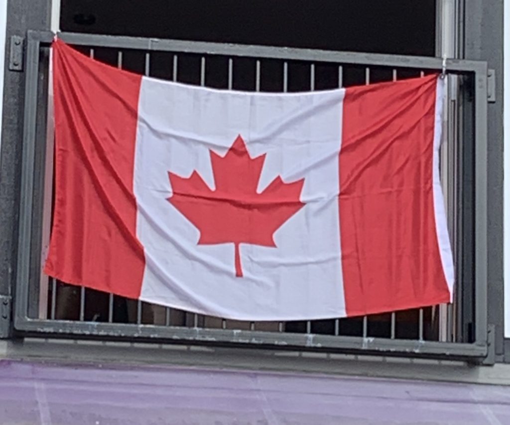
Kinda yes? The stem is a little skinny, but not bad for a plastic string of flags
This set of flags mostly commit the same error: being built on a 3:2 aspect ratio (that is, the flag is about 3 units wide and 2 units high). The correct spec for the Canadian Flag is 2:1, making it look quite long relative to other flags (or, if the same length, it would be less tall).
(As an aside, I wonder how serious protocol nerds spec out flags for big multi-country displays. Do they aim for a common height, making Canada’s flag among the long ones, or do they go for a common length, making Canada’s look small, or something fun like equalized area of flags? There’s probably an answer, I don’t care to check.)
Anyway, if you look through this fun list of national flag aspect ratios, you’ll see that 3:2 predominates. It’s the default aspect for rectangular flags. That said, 2:1 is pretty common too (indeed, the Union Jack is in that ratio, and so are most of the Commonwealth ensign flags, from Australia to Tuvalu; it goes without saying Canada’s previous flag was the Red Ensign…).
Other aspect ratios vary. USA: 19:10; Germany and some others, 5:3; Denmark, 37:28?! The winner is of course Nepal, whose flag is listed as “no aspect ratio” thanks to its fun double-triangle shape, which is tricky to get right, and has caused minor diplomatic incidents.
Nonetheless, if you see a whole bunch of flags, and you’re not seeing slight variations in the relative lengths or heights, you’re probably looking at a bunch of flags all built to be 3:2, which will be correct for Japan, France, Italy, and many others, but will be wrong for Canada and also many others.
Canadian Flag Errors, a Spotter’s Guide
There’s really just one big error, that 3:2, and a few rare errors. You’ll see variations in the construction of the maple leaf, I can’t really comment on the correct colors (I’d bet the red often varies more than the spec allows), and in rare cases you’ll see the relative widths of the three color sections screwed up (the white field is a square, the outer red fields are each half as wide as the white, anything else is a mistake). But if you’re looking at a 3:2 “Canadian flag,” the usual telltale is too much white space above and below the maple leaf. That’s the easy way I caught all of the error flags you see above on my walk through Steveston on Canada Day.
Notably, it didn’t seem like the quality of the flag’s construction mattered much. I saw plenty of nicely finished fabric flags that were wrong, and as you can see, the line of plastic flag bunting was pretty much right. Most of the t-shirts with flags on them seemed correct, too. One can speculate, but it’s likely that if you’re an indifferent flag-printing enterprise, it’s really easy to dump every flag into a 3:2 production template, and who’s going to know?
We will know. You and me. I haven’t blessed you with this knowledge, it’s a curse. Happy Canada Day!